Learning what really works on wall street for fun, and profit.
# Introduction
In this article we want to present what combination of variables are able to theoretically produce the best stock portfolios based on different investment profiles during the past 6 years.
During the first half of 2023 we have developed a paper trading platform that allows us to run large scale experiments on historical data to discover interesting insights that we can turn into high quality web for content you, our readers.
Predicting the stock market is a very difficult task and has been studied both academically and in the private sector for decades and has developed several schools of thought surrounding how the market works.
Specifically we will start out by validating the theories of Value investing in semi-realistic scenarios by running experiments that rank stocks based on widely accepted value investing theories. We will focus on running strategies that buy the best companies at the cheapest prices.
# Top 3 Strategies of Interest in terms of Sharpe, Returns, and Volatility
# How we construct performant portfolios?
Our specific research question for this study is the following: Which combination of measurable variables, stop loss tolerances, and sector weights produce the best portfolios for a risk adverse, risk neutral, and risk seeking investor.
In order to answer our research question we build out software that allows us to parameterize a trading strategy, execute it, and analyze the result of it's performance. We then generated thousands of strategies whose parameters have been randomly generated. Assuming that we have explored the search space enough to have obtained representative samples we can establish objective functions to optimize for, and determine what decisions lead to the best portfolios.
It must be noted that our data contains biases due to: the covid pandemic crash-boom-bust cycle clearly contained within our periods of analysis and market conditions that defined the era between 2017-2020 (low interest rates, low global conflicts, ect...); therefore, the conclusions reached in this article must be taken with a grain of salt and put into the larger economic context.
Our methodology is somewhat inspired by Monte Carlo methods of searching large spaces by using randomized techniques. The variables that we decided to use to rank a stock are described in the next section.
# "Measurable Variables" Used
- ROA: Return on assets, higher is better.
- ROD: Return on debt, higher is better.
- DivP: Price to dividend ratio, lower is better. This variable tells us how many dollars the market is willing to pay to participate in one dollar dividends of a company. A higher value means the market can be overvaluing the company. The variable looks at the total dividends paid in the past year. Our system ignores this ratio for companies that pay no dividends.
- PB: Price to Book ratio, lower is better. Higher values mean company is paying a higher price to own it's assets compared to peers.
- PE: Price to earnings ratio, lower is better. How many dollars the market pays to participate in one dollar earnings of the company.
- netTTM4QGrowth: 12 month net income growth, higher is better. The company is growing.
# What is ranking?
What exactly do we mean by ranking? A combined ranking system is a way to look at different measures all at once to make a decision. It's like making a fruit salad - you don't just consider one type of fruit, but mix different ones to create a delicious blend. In the same way, this system mixes various measures or criteria together. Each measure is given a certain weight or importance. By considering everything together, you get a clearer and more balanced understanding of what you're trying to evaluate.
Let's take an example to understand it better. Say we're trying to decide which stocks to invest in. We decide to use two measures: ROA and PE. ROA, or Return on Assets, tells us how much profit a company is making from its assets - a higher ROA is better. PE, or Price to Earnings ratio, shows us how much us have to spend to get a dollar of the company's earnings - a lower PE is better. Now, instead of just looking at one measure, we decide to use the combined ranking system. We give ROA a weight of 20% and PE a weight of 80%. This means we think PE is more important than ROA in this case. This way, we're looking at both measures at the same time and can make a more balanced decision about which stocks to invest in.
# Technical details
In order to simplify our problem space and build research traction we decided to start out by looking into trading strategies with the following characteristics. These details are rather technical so feel free to skip to the next section.
- The investor is not allowed to short sell stocks.
- We also distribute our assets across industries according to set weights.
- Capital is allocated every 3 months by re-scoring stocks.
- If a stock is re-scored we do not sell it, we only sell if hits stop loss.
- We will generate 20,000 random strategies and apply them to the stock market from the year 2017 to 2021. The random weights are used to calculate the rankings mentioned in the previous step.
- Every strategy includes a static stop loss that is also randomly generated.
- Take profit is not implemented in this experiment.
- Stocks are sold at the end of the fiscal year.
- Tax and transaction costs have not been taken into account.
- We only focused on companies with positive ROA and large market capitalizations.
# How did the Portfolios Perform?
Out of all of the twenty thousand portfolios tested, mean returns between 2017 and 2020 had a median of 26%, with the top 25% of portfolios performing above 31% and the bottom 25% performing below 22%.
Minimum and maximum portfolio returns respectively are 7%, 47%.
# Our methodology's Weaknesses
It's weakness are vast since the stock market is a complex environment but fundamentally we are using a relatively low amount of statistical measures in our ranking system, and we are also applying the same ranking system to every sector within the same strategy while there is plenty of evidence to suggest that we should rank stocks differently according to industry.
# Our methodology's Strengths
- Principle of Ocam's razor, low complexity systems can be better than high complexity.
- System is interpretable and could be rolled out in a couple of weeks.
- Interesting results can be observed from the first round of experiments.
# 3 Strategies of interest
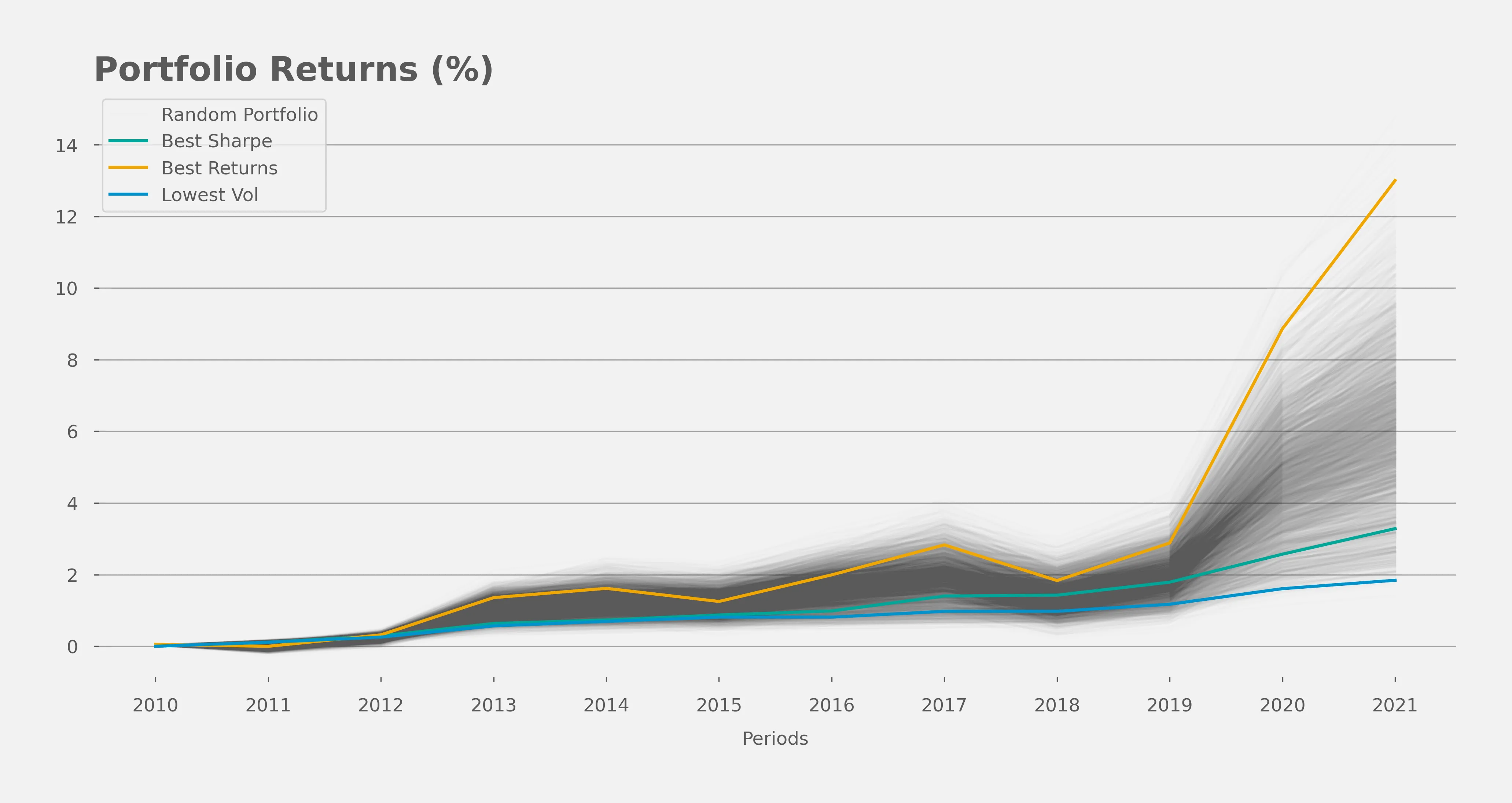
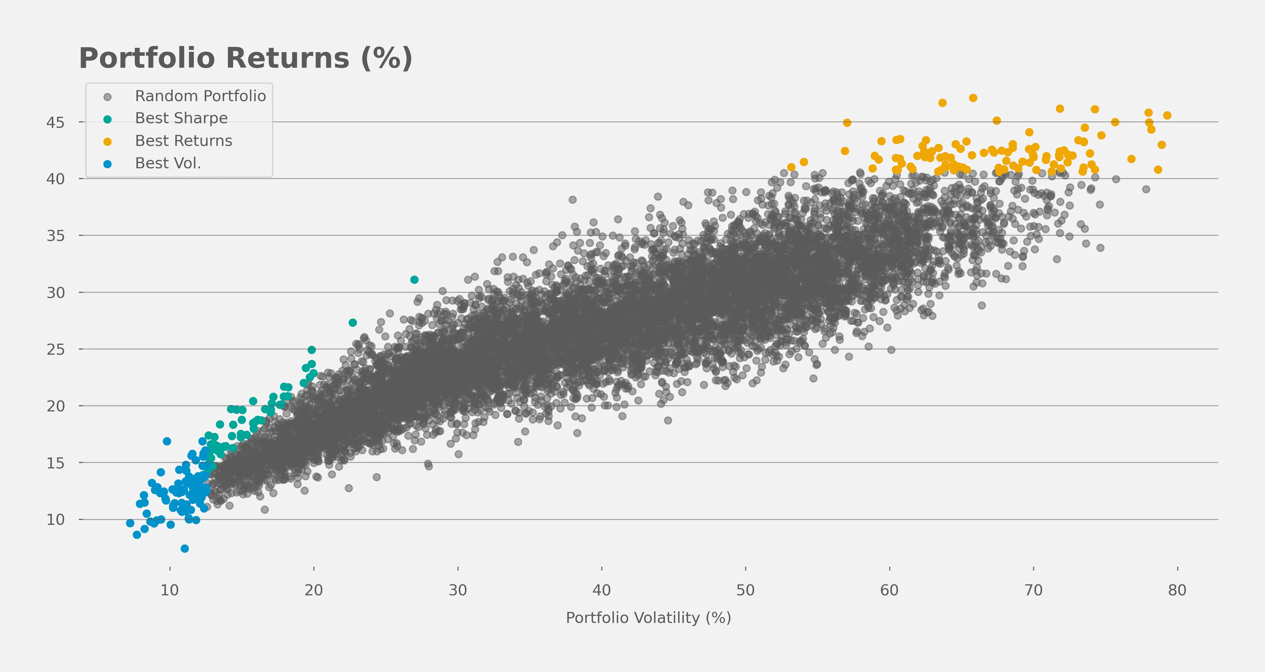
If we assume that there are 3 types of investors in the market, a risk adverse, risk neutral, and risk seeking individual we would like to also assume that these three individuals would seek to optimize for distinct objective functions. Specifically the risk adverse individual seeks to minimize the volatility of returns, the risk neutral will seek the portfolio that gives him the highest level of returns for every "point" of volatility he is willing to accept (specifically known as the sharpe ratio), and the risk seeking individual wants to receive the highest returns no matter the cost.
The three most interesting strategies maximize sharpe ratio, maximize returns, and minimizes volatility respectively. Note that all strategies only include long positions and don't hedge against wide market risks, hence the highly correlated series. What's interesting is to observe the difference in scales of returns between the different strategies.
One of these three strategies focuses on optimizing for the sharpe ratio, this statistic can be thought of as an exchange rate: how many points of returns will the market give you for every point of volatility that you pay. The portfolio with the highest Sharpe ratio will have the best bang for your buck.
The following figure shows all of the portfolios we tested by plotting their volatility against their returns, observe how our three groups of strategies are clearly concentrated around certain areas of our plot.
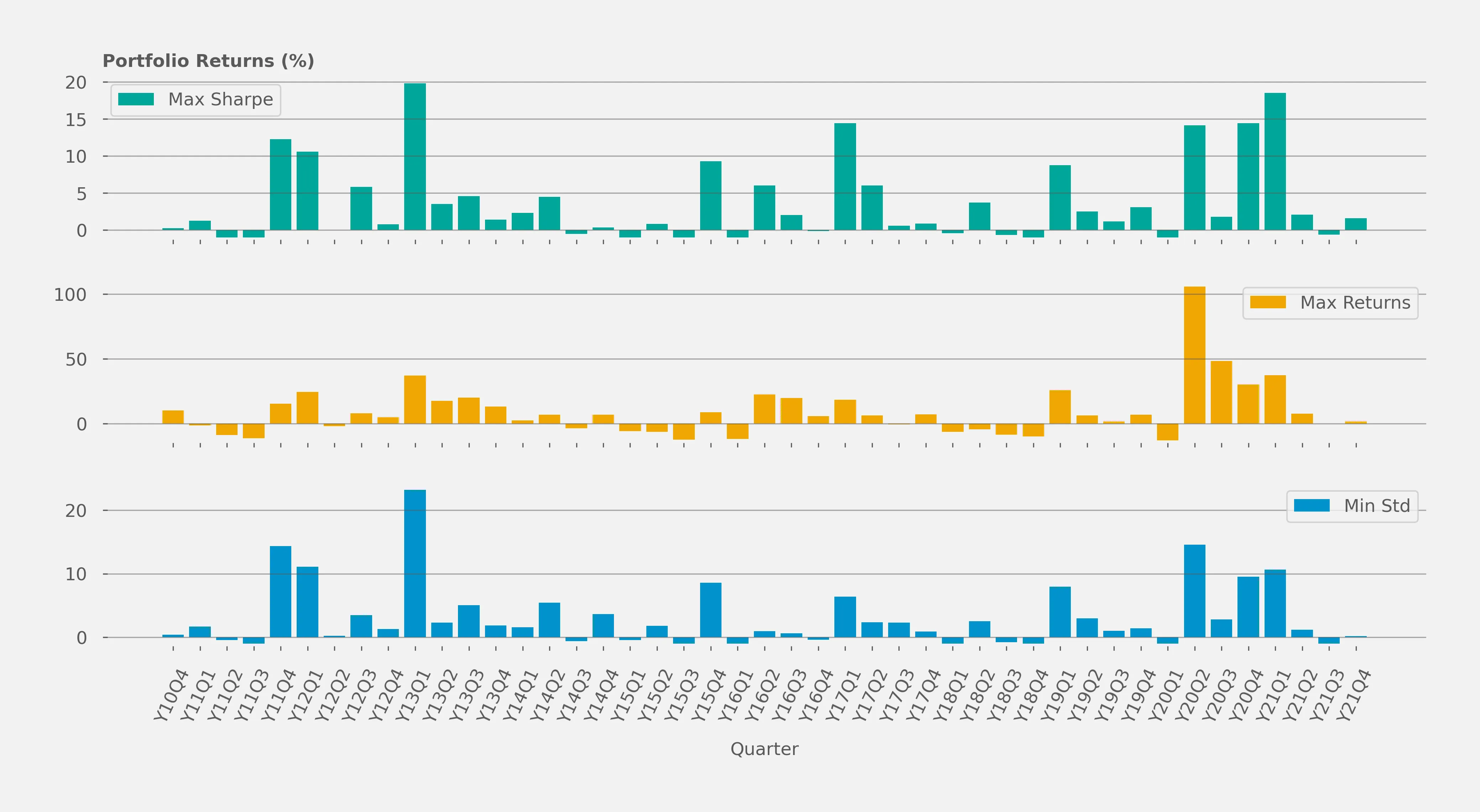
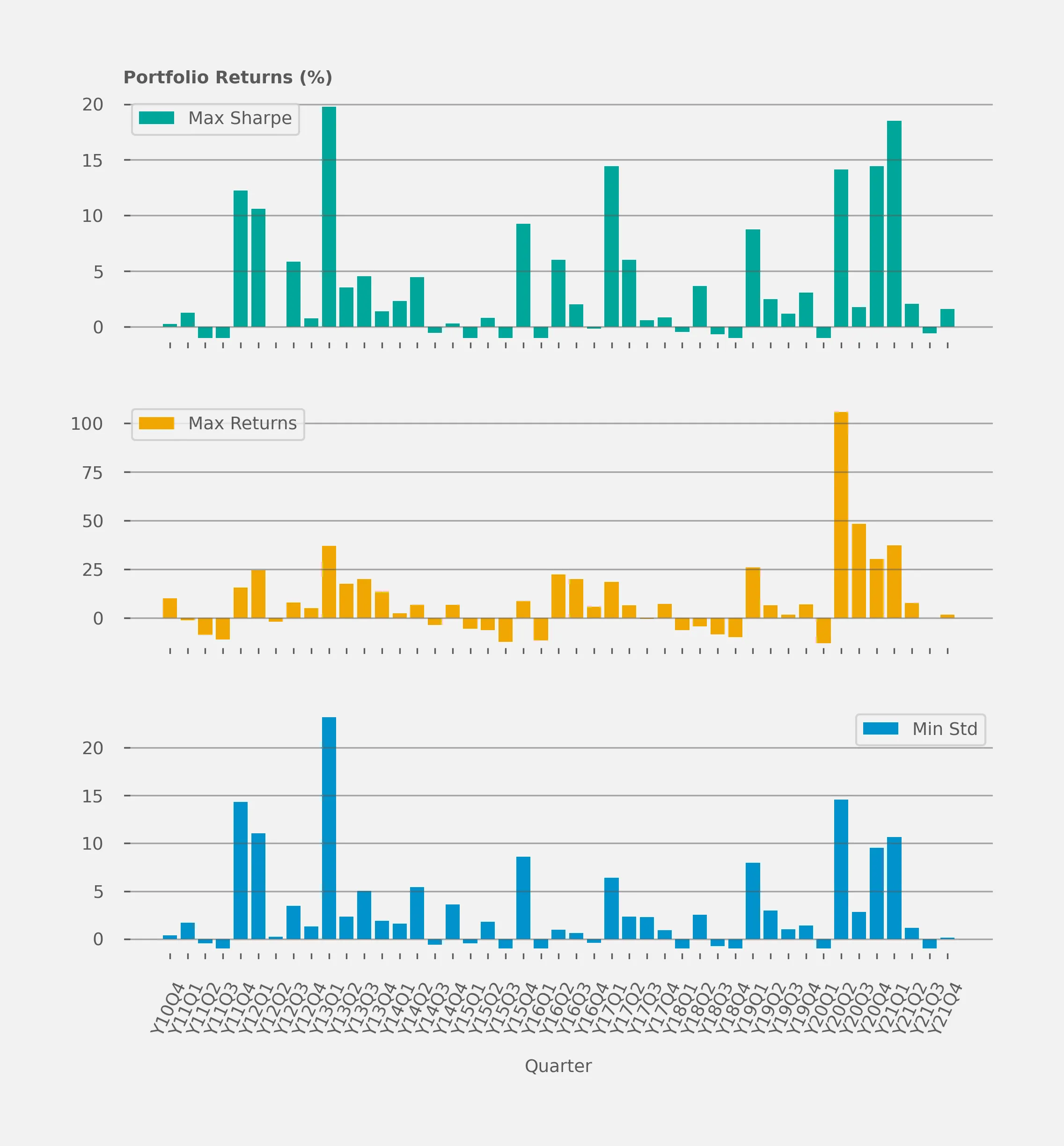
# Quarterly performance by strategy
The following figure shows the portfolio returns across every quarter evaluated in our periods of analysis.
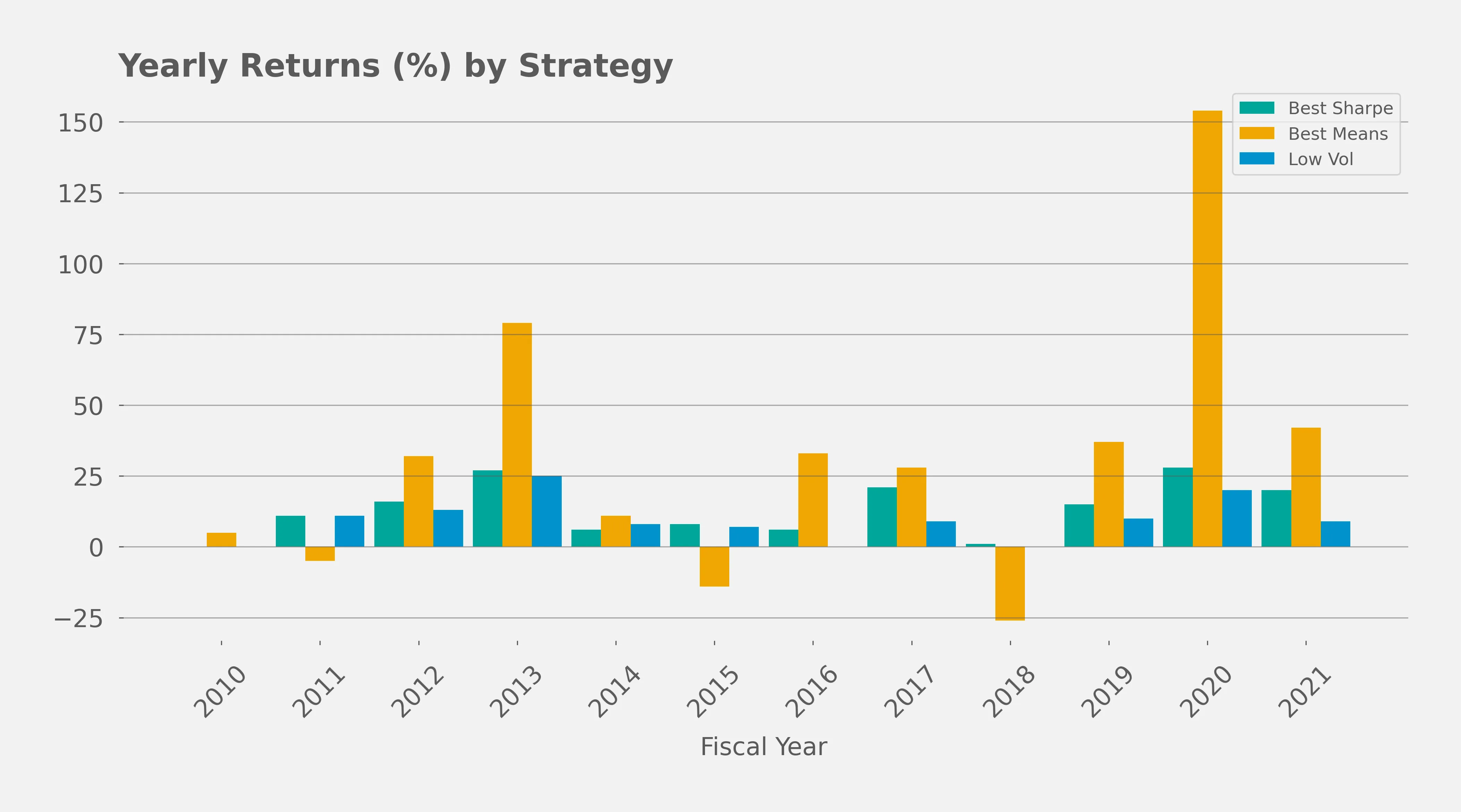
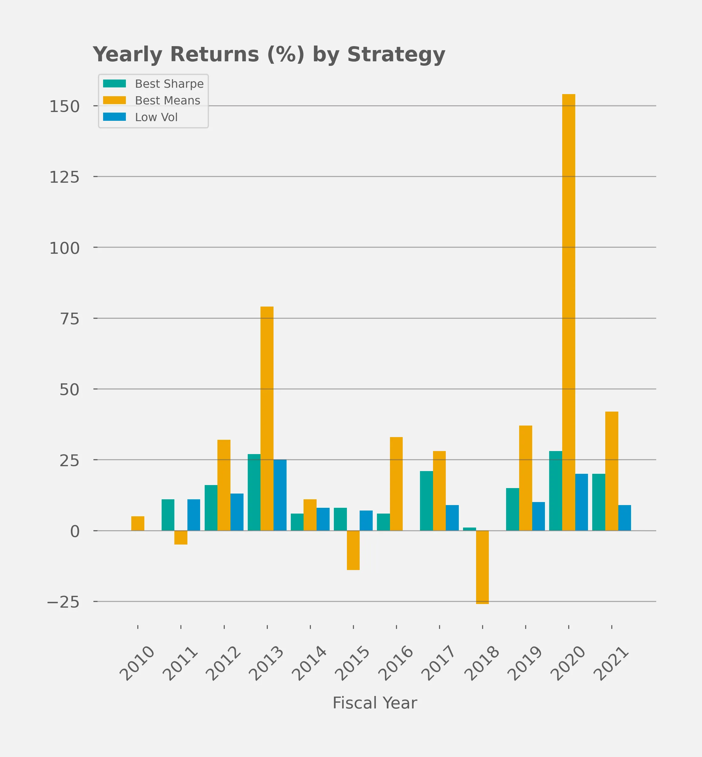
# Yearly average returns by strategy
# Rank weight average by strategy
The following figure shows how different strategies prioritize the measurable variables used in our analysis.
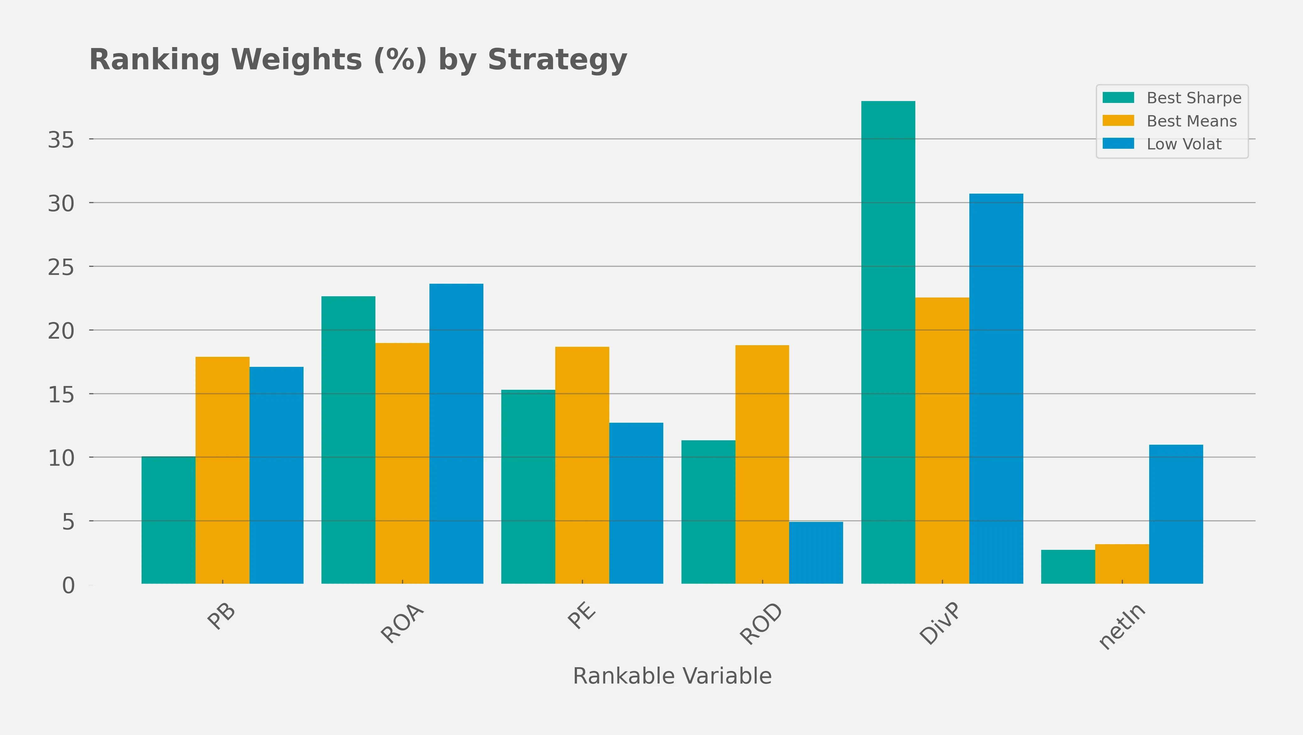
- We can observe that the strategy with higher returns spreads out the ranking system somewhat equally between the variables while the other strategies, that optimize for volatility adjusted risk, concentrate their rankings in a more prominent way.
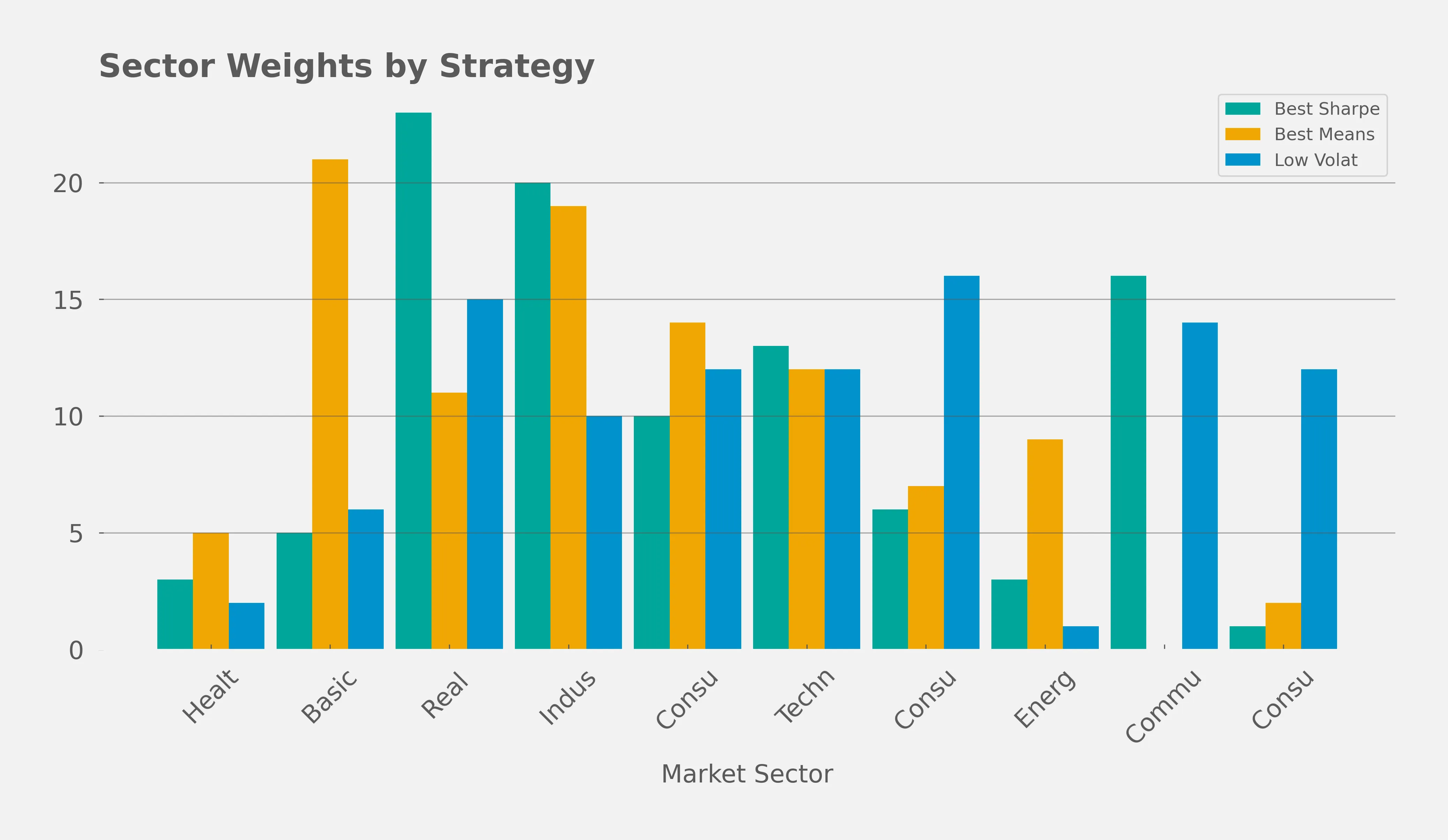
# Sector weight average by strategy
# Deeper Dive into 3 Portfolios
In the following segment we can observe the sector distribution, variable rank weights, and average returns for the three portfolios of interest. Feel free to skip directly the PCA analysis or the conclusions.
# Best Sharpe
- Stategy ID
846ce310 - 17% Average Returns (2017-2021)
- 10% Stdev of Returns (2017-2021)
- 1.72 Share Ratio
| year | 2010 | 2011 | 2012 | 2013 | 2014 | 2015 | 2016 | 2017 | 2018 | 2019 | 2020 | 2021 | All |
|---|---|---|---|---|---|---|---|---|---|---|---|---|---|
| Avg. Returns(%) | |||||||||||||
| Basic Materials | -1.00 | -0.32 | -1.00 | 13.11 | -1.00 | 6.03 | -1.00 | -1.00 | -1.00 | -1.00 | 9.87 | 16.63 | 3.47 |
| Communication Services | nan | 5.90 | 4.24 | 22.79 | -0.78 | 2.34 | -1.00 | 3.05 | -1.00 | -0.57 | 6.59 | 2.16 | 3.97 |
| Consumer Cyclical | -1.00 | 6.75 | 10.75 | 9.74 | -1.00 | -0.40 | 0.73 | 33.39 | 3.43 | 1.79 | 9.54 | 2.14 | 6.95 |
| Consumer Defensive | -1.00 | 1.41 | 4.16 | 1.73 | -1.00 | -1.00 | 2.50 | 1.89 | 1.92 | 1.97 | 5.31 | 0.58 | 1.71 |
| Energy | -1.00 | -1.00 | -1.00 | -1.00 | -1.00 | -1.00 | 46.86 | -1.00 | 3.44 | 8.63 | 7.88 | 12.48 | 6.49 |
| Healthcare | -1.00 | 0.47 | -1.00 | 6.68 | 48.38 | 3.40 | -1.00 | -1.00 | -1.00 | -1.00 | -1.00 | 25.40 | 6.94 |
| Industrials | -1.00 | 2.27 | 5.73 | 7.10 | -0.39 | 2.55 | -0.02 | 0.39 | -1.00 | 9.01 | 14.07 | 9.39 | 4.39 |
| Real Estate | 6.79 | 0.06 | 3.30 | -1.00 | 5.06 | -0.36 | 1.92 | 2.28 | 0.95 | 6.21 | 1.33 | 4.15 | 2.19 |
| Technology | 1.02 | 4.63 | 1.99 | 2.60 | -1.00 | 7.54 | 2.08 | 5.82 | 0.35 | 1.19 | 7.72 | 2.12 | 3.14 |
| All | 0.26 | 2.87 | 4.29 | 7.31 | 1.64 | 2.02 | 1.71 | 5.46 | 0.38 | 3.86 | 7.33 | 5.39 | 3.81 |
| Indicator | Weight |
|---|---|
| PB | 19 |
| ROA | 0 |
| PE | 6 |
| ROD | 36 |
| DivP | 36 |
| netIncomeTTM4QGrowth | 2 |
| Year | Returns |
|---|---|
| 2010 | 0 |
| 2011 | 11 |
| 2012 | 16 |
| 2013 | 27 |
| 2014 | 6 |
| 2015 | 8 |
| 2016 | 6 |
| 2017 | 21 |
| 2018 | 1 |
| 2019 | 15 |
| 2020 | 28 |
| 2021 | 20 |
| Sector | Weight |
|---|---|
| Healthcare | 3 |
| Basic Materials | 5 |
| Real Estate | 23 |
| Industrials | 20 |
| Consumer Cyclical | 10 |
| Technology | 13 |
| Consumer Defensive | 6 |
| Energy | 3 |
| Communication Services | 16 |
| Consumer Non-Cyclicals | 1 |
We can take a moment to deep dive into the specific transactions that this portfolio conducted, let's look at the top and worst trades made during 2017.
# Best and worst trades in 2017 by "Best Sharpe" strategy
The following table shows 5 random bad trades and the 5 best trades during the 2017. This table allows us to illustrate the internal mechanics of our trading system. What is is interesting to observe is the "Actual Ranking" columns that shows how we rank a specific stock. A lower rank indicates a better stock, the reason for this is due to the specific way we combine our variables and produce the "ranking". We could have perfectly chosen to have a "higher" rank be a "better".
| Sector | Ticker | Buy Date | Buy Price | Sell Date | Sell Price | ROA | PE | ROD | DivP | Actual Ranking | Net Income 4QG | Potential Returns | Stop Loss | Real Returns | Days Held | |
|---|---|---|---|---|---|---|---|---|---|---|---|---|---|---|---|---|
| index | ||||||||||||||||
| 0 | Energy | TK | Jun 2017 | 5.816 | Jul 2017 | 5.929 | 0.008 | 5.098 | 0.011 | -26.548 | 10.424 | 0.308 | 0.415 | 1 | -0.130 | 7 |
| 1 | Basic Materials | CLW | Sep 2017 | 49.250 | Oct 2017 | 44.100 | 0.015 | 31.674 | 0.022 | nan | 43.998 | -1.596 | -0.078 | 1 | -0.130 | 10 |
| 2 | Consumer Defensive | IMKTA | Jun 2017 | 30.378 | Jul 2017 | 27.092 | 0.029 | 12.352 | 0.041 | 47.367 | 31.328 | -0.569 | 0.051 | 1 | -0.130 | 10 |
| 3 | Consumer Cyclical | M | Jun 2017 | 18.116 | Jul 2017 | 16.432 | 0.029 | 9.686 | 0.037 | 12.034 | 26.410 | -0.634 | 0.119 | 1 | -0.130 | 10 |
| 4 | Healthcare | THC | Sep 2017 | 16.430 | Oct 2017 | 14.400 | 0.007 | 9.724 | 0.008 | 6.586 | 11.700 | -0.323 | -0.077 | 1 | -0.130 | 11 |
| 5 | Consumer Defensive | IMKTA | Sep 2017 | 23.562 | Dec 2017 | 31.924 | 0.029 | 9.805 | 0.040 | 36.733 | 28.608 | -0.099 | 0.355 | 0 | 0.355 | 91 |
| 6 | Basic Materials | TGB | Jun 2017 | 1.270 | Dec 2017 | 2.330 | 0.011 | 25.892 | 0.018 | nan | 41.855 | 4.694 | 0.835 | 0 | 0.835 | 182 |
| 7 | Basic Materials | RYAM | Sep 2017 | 13.209 | Dec 2017 | 19.789 | 0.024 | 21.174 | 0.029 | 44.929 | 41.413 | 0.267 | 0.498 | 0 | 0.498 | 91 |
| 8 | Consumer Cyclical | HOV | Sep 2017 | 48.250 | Dec 2017 | 83.750 | 0.007 | 18.998 | 0.007 | nan | 26.889 | -0.266 | 0.736 | 0 | 0.736 | 91 |
| 9 | Basic Materials | VHI | Sep 2017 | 25.847 | Dec 2017 | 65.824 | 0.013 | 21.923 | 0.016 | -27.182 | 32.974 | 1.966 | 1.547 | 0 | 1.547 | 91 |
# Best Returns
- Stategy ID
fb5fd579 - 47% Average Returns (2017-2021)
- 66% Stdev of Returns (2017-2021)
- 0.72 Sharpe Ratio
| year | 2010 | 2011 | 2012 | 2013 | 2014 | 2015 | 2016 | 2017 | 2018 | 2019 | 2020 | 2021 | All |
|---|---|---|---|---|---|---|---|---|---|---|---|---|---|
| Avg. Returns(%) | |||||||||||||
| Basic Materials | 6.78 | -3.70 | 11.49 | 14.14 | -2.92 | -4.02 | 7.10 | 19.91 | -9.29 | 1.02 | 55.56 | 12.83 | 9.27 |
| Consumer Cyclical | 11.97 | 2.47 | 9.75 | 26.07 | 10.25 | 3.06 | 12.46 | 19.32 | -4.74 | 8.85 | 42.43 | -0.21 | 11.79 |
| Consumer Defensive | 11.30 | 3.32 | 5.06 | 32.85 | -6.77 | -1.05 | 12.82 | 6.95 | -7.08 | 0.11 | 23.40 | 17.50 | 8.00 |
| Energy | 21.96 | 12.99 | -0.32 | 41.89 | -1.04 | -9.15 | 24.85 | -9.91 | -8.82 | 0.53 | 28.99 | 22.22 | 9.51 |
| Healthcare | 1.40 | -10.77 | 16.94 | 6.32 | 39.63 | -6.97 | -8.55 | 1.93 | -13.00 | 53.56 | 73.73 | 21.44 | 15.52 |
| Industrials | 7.70 | -5.88 | 17.69 | 20.27 | 0.41 | -8.29 | 7.48 | 2.74 | -8.55 | 20.56 | 52.62 | 5.55 | 9.48 |
| Real Estate | 6.79 | -3.47 | 9.20 | 2.95 | 8.87 | -4.56 | 7.74 | 7.02 | -2.90 | 6.75 | 16.41 | 23.43 | 6.50 |
| Technology | 10.81 | -1.61 | -4.43 | 36.13 | 0.58 | -0.28 | 6.42 | -0.77 | -4.76 | 11.28 | 38.29 | 7.61 | 8.10 |
| All | 10.11 | -1.37 | 8.88 | 22.01 | 3.08 | -3.88 | 9.13 | 7.89 | -7.19 | 10.21 | 42.87 | 11.64 | 9.40 |
| Indicator | Weight |
|---|---|
| PB | 10 |
| ROA | 30 |
| PE | 31 |
| ROD | 19 |
| DivP | 6 |
| netIncomeTTM4QGrowth | 4 |
| Year | Returns |
|---|---|
| 2010 | 5 |
| 2011 | -5 |
| 2012 | 32 |
| 2013 | 79 |
| 2014 | 11 |
| 2015 | -14 |
| 2016 | 33 |
| 2017 | 28 |
| 2018 | -26 |
| 2019 | 37 |
| 2020 | 154 |
| 2021 | 42 |
| Sector | Weight |
|---|---|
| Healthcare | 5 |
| Basic Materials | 21 |
| Real Estate | 11 |
| Industrials | 19 |
| Consumer Cyclical | 14 |
| Technology | 12 |
| Consumer Defensive | 7 |
| Energy | 9 |
| Communication Services | 0 |
| Consumer Non-Cyclicals | 2 |
# Lowest Volatility
- Stategy ID
fb5fd579 - 10% Average Returns (2017-2021)
- 7% Stdev of Returns (2017-2021)
- 1.34 Sharpe Ratio
| year | 2010 | 2011 | 2012 | 2013 | 2014 | 2015 | 2016 | 2017 | 2018 | 2019 | 2020 | 2021 | All |
|---|---|---|---|---|---|---|---|---|---|---|---|---|---|
| Avg. Returns(%) | |||||||||||||
| Basic Materials | -1.00 | -1.00 | 7.37 | 8.95 | -1.00 | -1.00 | -1.00 | -1.00 | -1.00 | -1.00 | -1.00 | 16.63 | 2.20 |
| Communication Services | nan | 6.89 | 4.99 | 22.92 | -1.00 | 2.84 | -1.00 | 3.70 | -1.00 | -1.00 | 7.67 | 1.11 | 4.19 |
| Consumer Cyclical | -1.00 | 6.75 | 7.49 | 7.17 | -1.00 | -0.45 | 0.73 | 9.73 | 3.43 | -1.00 | 6.43 | 2.14 | 3.74 |
| Consumer Defensive | -1.00 | 3.90 | 1.19 | 2.46 | 2.85 | 2.78 | 1.34 | 1.16 | 0.10 | 2.91 | 3.81 | -0.41 | 1.97 |
| Healthcare | -1.00 | 0.47 | -1.00 | 6.68 | 54.26 | -1.00 | -1.00 | -1.00 | -1.00 | -1.00 | -1.00 | 25.40 | 7.07 |
| Industrials | -1.00 | 1.83 | 8.98 | 7.27 | 0.22 | 1.03 | -1.00 | 2.47 | -1.00 | 10.34 | 10.53 | -0.29 | 3.57 |
| Real Estate | 6.79 | 0.29 | 4.27 | -1.00 | 5.55 | -0.00 | 0.84 | 2.30 | -0.17 | 7.78 | 1.81 | 3.81 | 2.35 |
| Technology | 1.42 | 4.24 | -1.00 | 10.75 | -1.00 | 9.24 | -0.91 | 1.97 | -1.00 | 5.23 | 16.86 | 1.54 | 4.11 |
| All | 0.38 | 3.65 | 4.01 | 8.11 | 2.51 | 2.24 | 0.04 | 2.99 | -0.06 | 3.34 | 6.47 | 2.75 | 3.24 |
| Indicator | Weight |
|---|---|
| PB | 22 |
| ROA | 36 |
| PE | 15 |
| ROD | 1 |
| DivP | 23 |
| netIncomeTTM4QGrowth | 2 |
| Year | Returns |
|---|---|
| 2010 | 0 |
| 2011 | 11 |
| 2012 | 13 |
| 2013 | 25 |
| 2014 | 8 |
| 2015 | 7 |
| 2016 | 0 |
| 2017 | 9 |
| 2018 | 0 |
| 2019 | 10 |
| 2020 | 20 |
| 2021 | 9 |
| Sector | Weight |
|---|---|
| Healthcare | 2 |
| Basic Materials | 6 |
| Real Estate | 15 |
| Industrials | 10 |
| Consumer Cyclical | 12 |
| Technology | 12 |
| Consumer Defensive | 16 |
| Energy | 1 |
| Communication Services | 14 |
| Consumer Non-Cyclicals | 12 |
# PCA Analysis
- We ran a PCA analysis on our portfolios ranking systems and sector to observe visual correlations between returns and low rank approximations of our portfolios.
- One interesting projection shows that a set of academically accepted value factors indeed contribute to a portfolios returns.
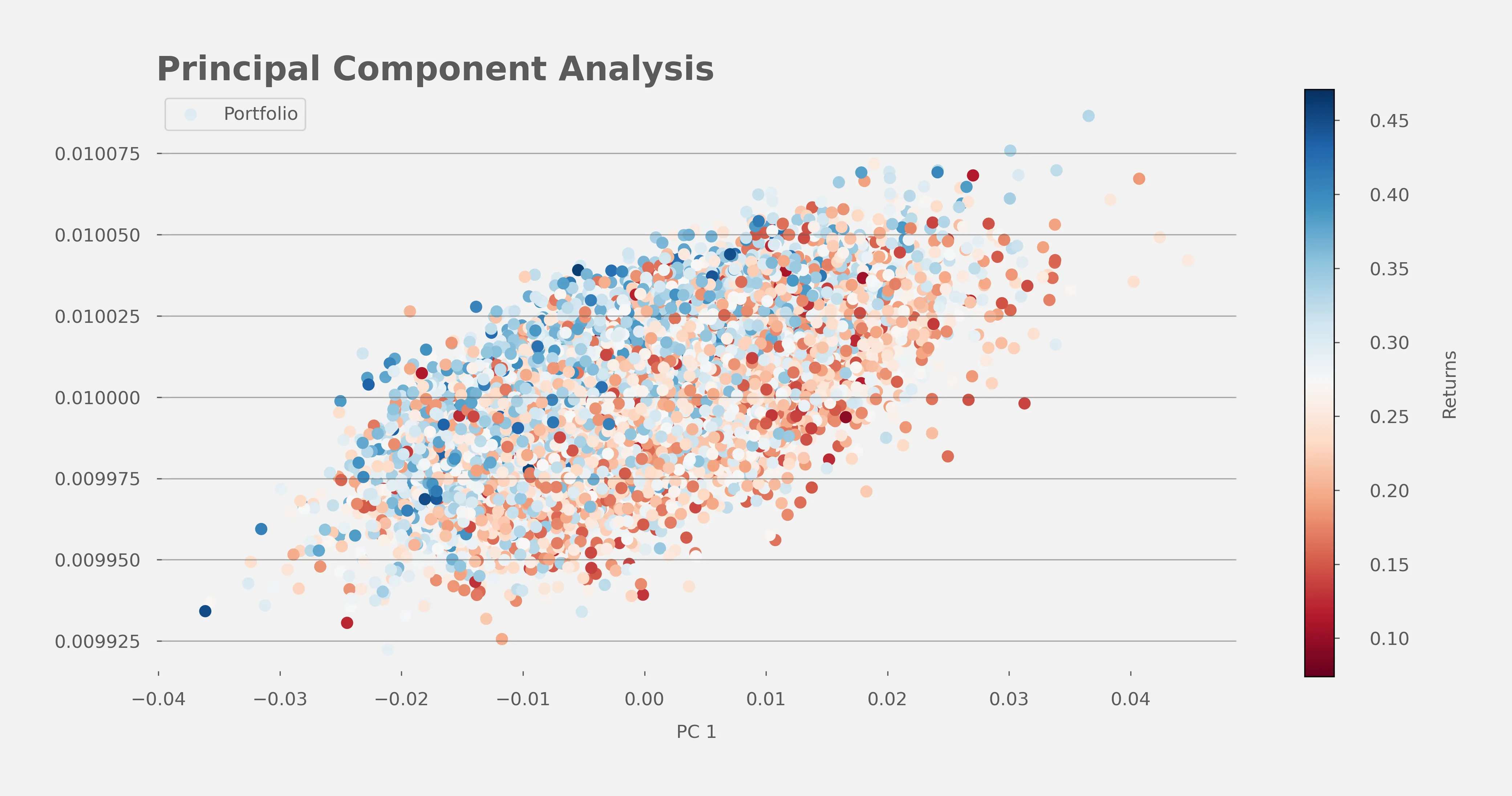
As we can observe in our last figure, as the data points shift towards the left (indicating movement in the negative direction along the 1st principal axis), a distinct increase in the objective value is observed. This trend suggests a robust, inverse correlation between the positioning of portfolios along the 1st principal axis and the corresponding objective values.
Expressed in layman's terms, we can deduce that by choosing any portfolio arbitrarily and making a slight modification to its ranking system—such that it places greater weight on the variables Return on Debt (ROD), Price-to-Earnings (PE), and Price-to-Book (PB), while lessening the emphasis on variables like Four Quarter Trailing Net Income Growth (netIncomeTTM4QGrowth) and Return on Assets (ROA)—we are likely to witness an enhancement in returns during our specified analysis periods.
An important metric to look at when analyzing principal axis is to understand how much of the variation in our data is accounted by using these axis. In our experiment we observed the following metrics, each position corresponds to the nth principal axis: 49%, 13%, 13%, 13%, 13%, 13%. Specifically the 1sth component that is visualized in the pca plot accounts for 13% of the variability (normalized to the first 6 components).
We decided to communicate the 1st component as we observed that the 0th principal component are a vector with all positive values, therefore not providing insights for our scenario.
For those who are technically inclined you may observe the actual vectors of our principal axes in the tables below.
The following tables describe the 1st and 0th principal axes. Each portfolio vector can be approximated by combining the portfolio principal components with their principal axes.
| Principal Axis 1 | |
|---|---|
| Variables | |
| ROD | -49.54 |
| PB | -37.51 |
| PE | -16.83 |
| DivP | 3.82 |
| netIncomeTTM4QGrowth | 27.54 |
| ROA | 71.29 |
| Principal Axis 0 | |
|---|---|
| Variables | |
| PB | 40.30 |
| netIncomeTTM4QGrowth | 40.61 |
| ROD | 40.72 |
| PE | 40.94 |
| DivP | 41.09 |
| ROA | 41.28 |
# Conclusions
Given the data generated in this study, taking into consideration all of the caveats mentioned already in this article we would like to summarize some interesting conclusions from this study.
- It may be possible that riskier yet higher reward yielding portfolios put less focus on Price to Book ratios and more on Price to Earnings ratios, especially for Basic Materials and Industrial companies.
- During the period of analysis, a higher ROD -- as opposed to the more traditional ROA, seemed to be a better indicator of high growth companies. This could be explained in large part by the cheap interest rates that defined the era.
- The 4 quarter net income growth does not seem to perform well combined with the rest of the variables used in our analysis.
# Data
The raw trades for the top 90 strategies can be downloaded here (opens new window) and summary statistics of the portfolios can be downloaded here (opens new window).
# Footnotes
- Initially we wanted to strictly rank stocks using a combination of the variables we selected; however due to a bug we introduced this constraint was not strictly satisfied. Companies that did not report dividends should have gotten assigned a dividend of 0, but instead they usually were null. This in turn caused our ranking system to simply exclude it from the rank calculation. Materially this caused our ranking system to treat dividend paying stocks differently than non dividend paying stocks.
- Although we did not include randomization to how different variables are ranked -- we manually decided which variables are ranked in descending (higher is better) or ascending order (lower is better); however there is reason to believe that interesting strategies might be found by experimenting with different ways we have decided to rank our variables. Specifically we could potentially find that companies with very high dividend to price ratios have been "identified" by the market to already contain some sort of moat that will allow it to continue to grow in value.
# References
- O'Shaughnessy JP. What Works on Wall Street (opens new window). 4th ed. New York, NY: McGraw-Hill; 2011.
- Greenblatt J. The Little Book That Still Beats the Market (opens new window). Hoboken, NJ: John Wiley & Sons, Inc.; 2010.
- Wikipedia. Random search. Updated June 27, 2023. Accessed July 2, 2023. Random Search (opens new window)
© Cross Entropy Solutions, 2023.
Innovation Through Digital Solutions
info@crossentropy.solutions
